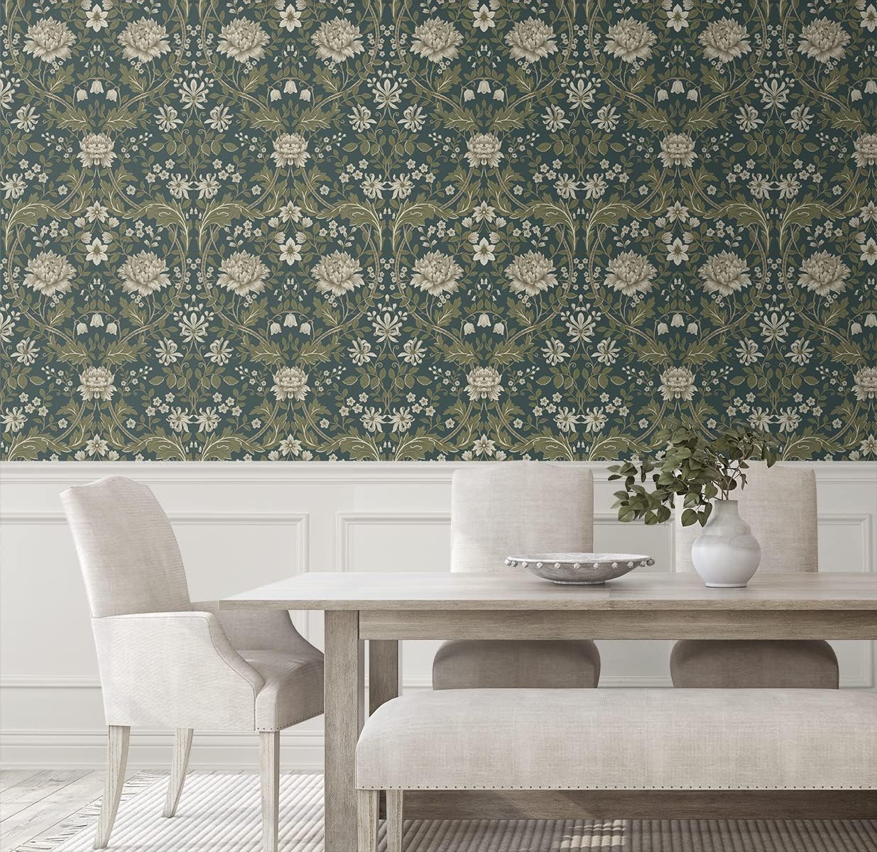
Gray walls had their moment, but let’s be real—they can feel cold and blah once fall rolls in 🍂. If your living room feels more like a waiting room than a cozy retreat, this is for you.
Hey, I’m Chloe—your home-style BFF who finds Pinterest-worthy looks you can actually pull off in a U.S. apartment or house without spending a fortune.

Today I’ll show you 5 earthy color palettes that instantly warm up your home this fall—complete with real paint shades, décor tips, and easy swaps.
🌿 Why Earthy Beats Gray for Fall

Before we dive in, here’s the thing: color psychology tells us that warm, nature-inspired hues like terracottas and olives evoke feelings of grounding and comfort—like the coziness of a crackling fire or autumn leaves.
Gray, on the other hand, is a cool neutral. It can come off sterile and distant—great for modern minimalism, but not so much when you’re snuggling up with pumpkin spice.
I’ve switched from gray to these palettes in my own Chicago apartment, and trust me—the difference is night and day.
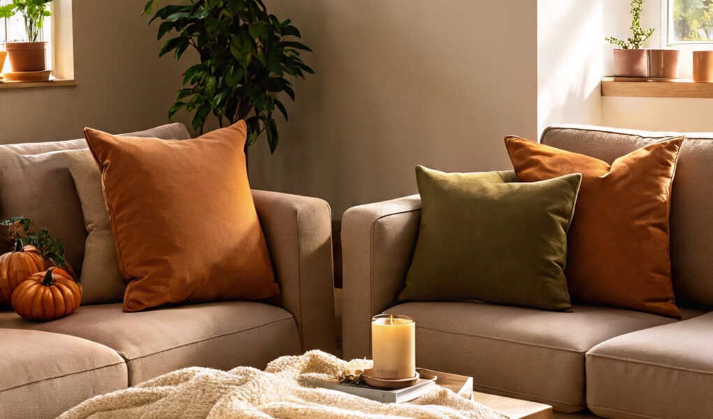
🤎 Palette 1: Terracotta & Cream Comfort
Imagine curling up on a sofa that feels like a warm hug from the earth itself—this palette brings that grounded vibe with soft, inviting layers.
Colors in the Palette:
- Terracotta: Sherwin-Williams Cavern Clay SW 7701 (a rich, rusty orange-brown that screams fall foliage).
- Warm Cream: Behr Swiss Coffee 1812 (a soft, buttery neutral to balance the boldness).
- Olive Green: Benjamin Moore Saybrook Sage HC-114 (a muted green for that natural, serene touch).
How to Use It in Real Homes:
- Paint one accent wall in Cavern Clay—it instantly makes a space feel inviting without overwhelming small U.S. apartments.
- Layer in cream throw blankets on your couch and olive vases on shelves for a textured, grounded look.
- Perfect for living rooms or dining areas where you host fall potlucks.
Pinterest-Style Mood Board:
Picture a plush cream rug underfoot, terracotta cushions scattered on a neutral sofa, and olive branches in a simple vase—it’s like stepping into a cozy cabin, but in your suburban home.
✨ Before/After Tip: Swap your gray throw pillows for terracotta ones—instantly cozier! I did this last fall, and my Netflix nights felt way more inviting.
Where to Shop:
- Terracotta pillow covers → Amazon (under $20 for a set).
- Cream slipcover → Affordable options on Amazon.
- Peel-and-stick wallpaper in olive patterns → Amazon finds.
🌲✨ Palette 2: Deep Forest & Mustard Glow
This one’s for those crisp fall hikes—bring the outdoors in with deep greens that glow against sunny mustard accents. It’s energizing yet calming, ideal for busy American households.
Colors in the Palette:
- Deep Forest: Sherwin-Williams Evergreen Fog SW 9130 (a moody green trending for 2025).
- Mustard: Behr Harvest Gold PPU6-05 (a warm, golden yellow that adds autumn sunshine).
- Soft Taupe: Benjamin Moore Ashwood Moss 1484 (a neutral base to tie it all together).
How to Use It in Real Homes:
- Go bold with Evergreen Fog on kitchen cabinets—durable and hides fingerprints.
- Add mustard curtains or lampshades for light-filtering glow.
- Ground it all with taupe rugs.
Pinterest-Style Mood Board:
Envision forest-green walls lit by mustard throw blankets, with taupe artwork framing windows—like your own glowing woodland retreat 🌲, perfect for rainy afternoons.
✨ Before/After Tip: Ditch gray lamps for mustard ones. The warm light changes everything. In my setup, it made remote workdays feel way less drab.
Where to Shop:
- Mustard accent rugs → Amazon (great under $50).
- Forest green vases → Budget-friendly on Amazon.
- Taupe peel-and-stick tiles → Amazon search.
🌸🖤 Palette 3: Clay Pink & Charcoal Balance
Subtle sophistication meets earthy warmth—soft pinks balanced by deep charcoals for a modern twist on fall coziness. Perfect for urban U.S. pads.
Colors in the Palette:
- Clay Pink: Benjamin Moore Tissue Pink 2003-70 (dusty rose, warm and inviting).
- Charcoal: Sherwin-Williams Iron Ore SW 7069 (deep gray-black with warmth).
- Warm Beige: Behr Toasted Walnut PPU5-08 (neutral that softens everything).
How to Use It in Real Homes:
- Use Tissue Pink on bedroom walls—pairs great with morning light.
- Add charcoal frames or side tables for depth.
- Beige bedding keeps it grounded.
Pinterest-Style Mood Board:
Soft pink walls, charcoal pillows, beige throws, and candles flickering—it’s balanced, feminine, and totally fall-ready.
✨ Before/After Tip: Replace gray art with charcoal-framed prints; adds instant depth. I refreshed my hallway this way, and guests always comment.
Where to Shop:
- Clay pink cushions → Amazon.
- Charcoal rugs → Affordable Amazon options.
- Beige peel-and-stick wallpaper → Amazon finds.
🍊💙 Palette 4: Rust Orange & Denim Blue
Bold and beachy with a fall twist—this palette mixes fiery rust with cool denim for dynamic, welcoming energy.
Colors in the Palette:
- Rust Orange: Sherwin-Williams Rustic Red SW 7593 (deep, earthy orange).
- Denim Blue: Benjamin Moore Hale Navy HC-154 (rich, calming blue).
- Light Taupe: Behr Perfect Taupe PPU18-13 (a sandy neutral to blend it all).
How to Use It in Real Homes:
- Paint rust orange on a feature wall—it energizes family rooms.
- Denim blue curtains or accents balance the warmth.
- Taupe sofas tie the whole palette together.
Pinterest-Style Mood Board:
Rust pillows on denim upholstery, taupe floors below—it’s vibrant, like a sunset over jeans 👖🌅 but still homey.
✨ Before/After Tip: Swap gray curtains for denim blue; instantly warmer. I did it in my living room—game-changer for fall gatherings.
Where to Shop:
- Rust orange blankets → Amazon.
- Denim blue vases → Amazon finds.
- Taupe rugs → Budget-friendly on Amazon.
🪵🌿 Palette 5: Sand Beige & Olive Serenity
Zen meets desert dunes—subtle earthy tones that bring peace after busy fall days.
Colors in the Palette:
- Sand Beige: Sherwin-Williams Accessible Beige SW 7036 (timeless for 2025).
- Olive: Behr Olive Branch PPU11-19 (soft, herbal green).
- Warm Gray-Brown: Benjamin Moore Cinnamon Slate 2113-40 (adds depth without coolness).
How to Use It in Real Homes:
- Paint walls in Accessible Beige for a clean, flexible canvas.
- Scatter olive pillows + Cinnamon Slate art for pops.
- Works perfectly in bathrooms or reading nooks.
Pinterest-Style Mood Board:
Beige walls with olive plants and slate accents—it’s serene, like a sandy trail through olive groves.
✨ Before/After Tip: Trade gray towels for olive ones in the bath. Spa-like vibes instantly! I did this in my guest bath, and now everyone loves it.
Where to Shop:
- Sand beige throws → Amazon.
- Olive vases → Amazon décor.
- Peel-and-stick slate wallpaper → Amazon.
🍁 Wrapping It Up
So whether you’re sipping pumpkin spice on your couch or hosting a cozy dinner, these earthy palettes make your home feel less sterile and more soul-filled.
👉 Which palette feels most you? Drop it in the comments—I love hearing what cozy vibes you’re going for this season 🧡.